Case study · Website · 2026
Tandartspraktijk Hengelo
Tandartspraktijk Hengelo is a family dental practice on the Dennenbosweg, run by dentists Asil and Inás Alsalem since 2007. Their website had grown into a collection of sections that hid the three things a patient actually visits for: registering, checking opening hours, and finding the emergency number.
Challenge
The old homepage opened with a looping video and no headline, so a first-time visitor saw a ceiling and a blue bar before any words. The registration form hung off the bottom of that video, the emergency number lived in the footer, and opening hours appeared twice on the same page with different times. The Google Maps embed showed only "Laden...". On a phone, seven navigation links wrapped onto two rows.
For a practice that takes new patients, every one of those is a lost registration or an unnecessary phone call to the front desk, which is only staffed by phone until 15:00.
Constraints: the practice's existing logo, photos and video had to stay. The copy stays in Dutch and in the practice's own voice. The Klantenvertellen review widget and the KNMT emergency line are third-party pieces that had to be embedded, not rebuilt.
Approach
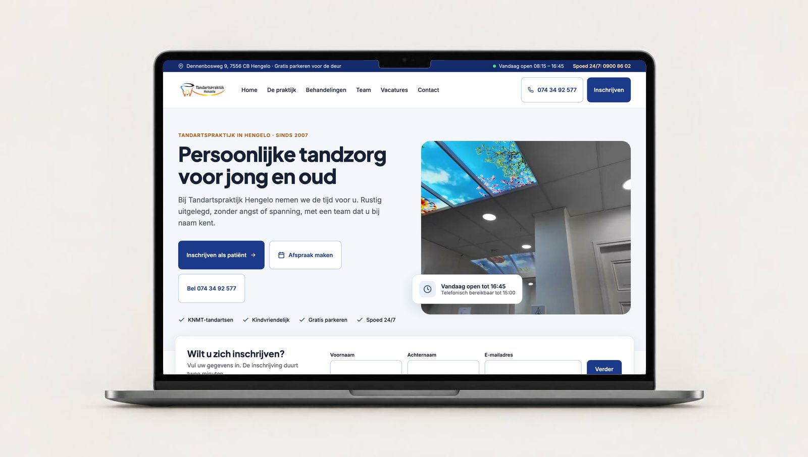
Put the three patient tasks on the first screen. A slim top bar now shows the address, whether the practice is open right now, and the 24/7 emergency number. The hero gets a real headline, "Persoonlijke tandzorg voor jong en oud", with three buttons in priority order: register, book an appointment, call. The registration form sits directly under it with a promise that it takes two minutes.
Make every page from the same parts. The header and footer are shared components, so the emergency band, the review block and the opening hours are identical on all eleven pages and only need updating in one place. Each page was designed at 1280 and 390 pixels side by side, so the mobile version is a deliberate layout, not whatever the desktop one collapsed into.
Outcome
The practice now has a complete set of pages: home, the practice, our vision, treatments, team, individual team members, house rules, vacancies, contact and registration, each in a desktop and a mobile version. New patients can register without calling, the emergency number is visible on every page, and opening hours come from one place.
Handover: [the design canvas with all artboards and shared components / the production site with a CMS the practice updates itself / a recorded walkthrough]. [Who maintains it now.]
- Designed for desktop and mobile
- 11 pages
- To register as a new patient, no phone call needed
- 2 minutes
- Opening hours and emergency number, shown on every page
- 1 place